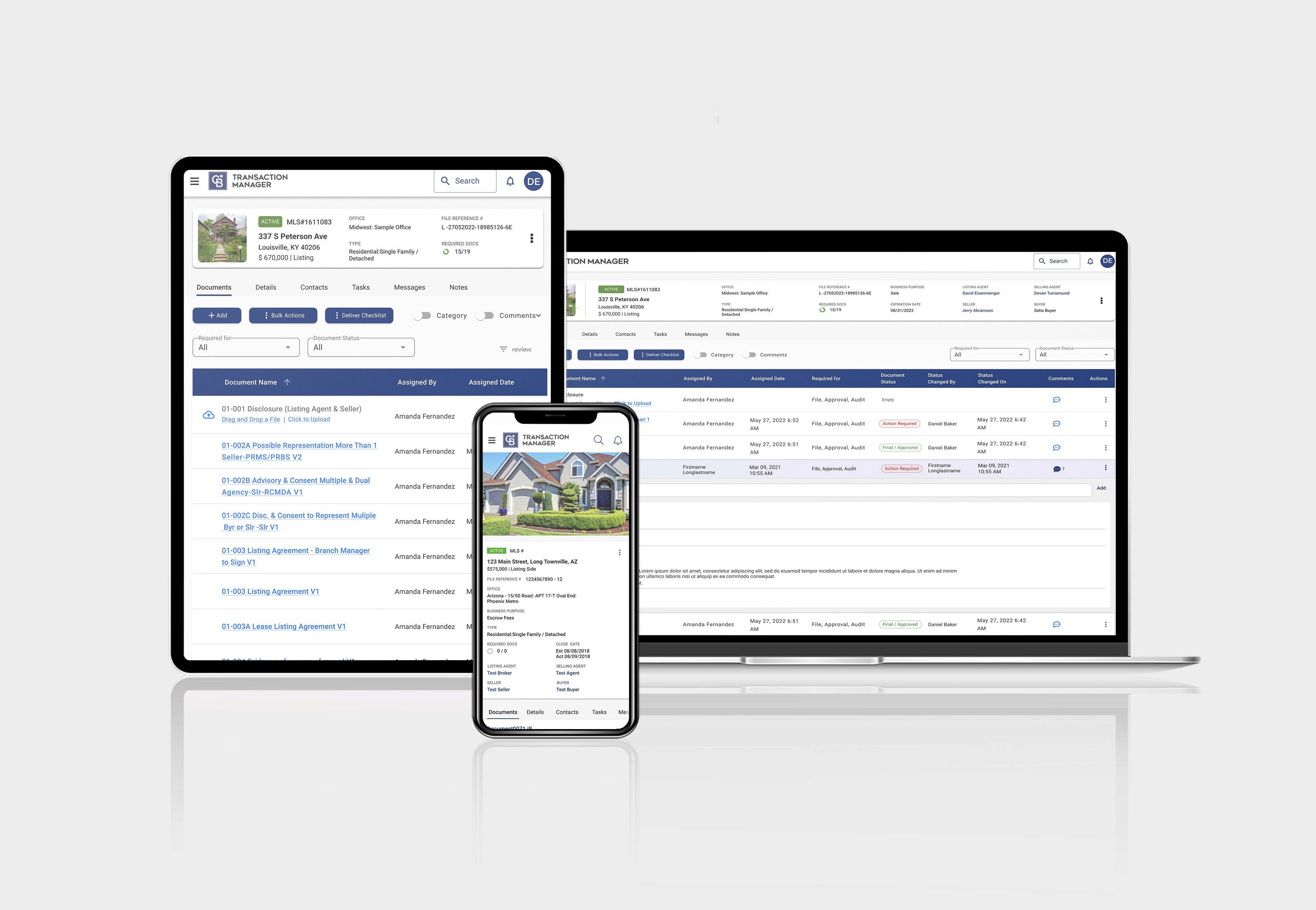
Transaction Manager

Anywhere're Real Estate,B2B UX/UI Design Web App
Project Overview
Transaction Manager is a web-based platform that helps real estate professionals manage deals, documents, and transaction workflows. The existing product was designed by developers with no design system, no consistent branding, and a messy interface. Users struggled to find files and complete basic tasks, leading to frustration and high support ticket volume.
The Problem
The interface was confusing with poor visual hierarchy. There was no design system, so every component was built from scratch inconsistently. Users had a hard time finding files because the dashboard was cluttered. Critical information like file names, status, and updates required opening individual files, slowing down workflows. Navigation was complex, making key features hard to locate.
The Goal
Redesign the platform with a unified design system to improve usability, speed up task completion, and reduce support burden.
The Solution
Created Transaction Manager's first comprehensive design system and redesigned core workflows with modern UI, clear hierarchy, and intuitive patterns—resulting in higher user satisfaction, faster task completion, and fewer support tickets.
My Contribution
Led UX research with real users (agents, office admins)
Built a design system (components, patterns, accessibility)
Designed improved UI flows for key tasks (uploading documents, task lists, deal overview)
Prototyped and tested solutions in high fidelity
Worked with developers through weekly feedback loops
Results
40% | 30% | 25% |
|---|---|---|
User satisfaction | Faster task completion | Fewer support tickets |
Before
A developer-designed interface with no brand consistency. Confusing navigation with too many menu items. Cluttered dashboard that required opening files to see basic information like status or names. Inconsistent UI patterns across different franchise brands. Slow, multi-step workflows.
User Feedback:
"I spend half my time just trying to find where to upload documents"
"Every franchise brand has different buttons—I have to relearn everything"
"The interface is so confusing, I avoid using certain features"

After
A clean, unified interface with consistent design system. Simplified navigation. Redesigned dashboard with a table view showing file names, status, and key information without opening files. Consistent UI across all franchise brands. Fast, intuitive workflows.
User Feedback:
"Much easier to find files, and the UI looks sleek and clean" (Erica, Realtor)
"The drag-and-drop upload is a game changer—saves me so much time"
"Finally feels like modern software"

My Approach
Insights & Idea: Finding the Real Problems
I started by identifying what users actually struggled with. I interviewed 10 real estate professionals (6 agents, 4 office admins) and shadowed 3 agents during actual transaction workflows. I also analyzed 6 months of support tickets to see recurring issues.
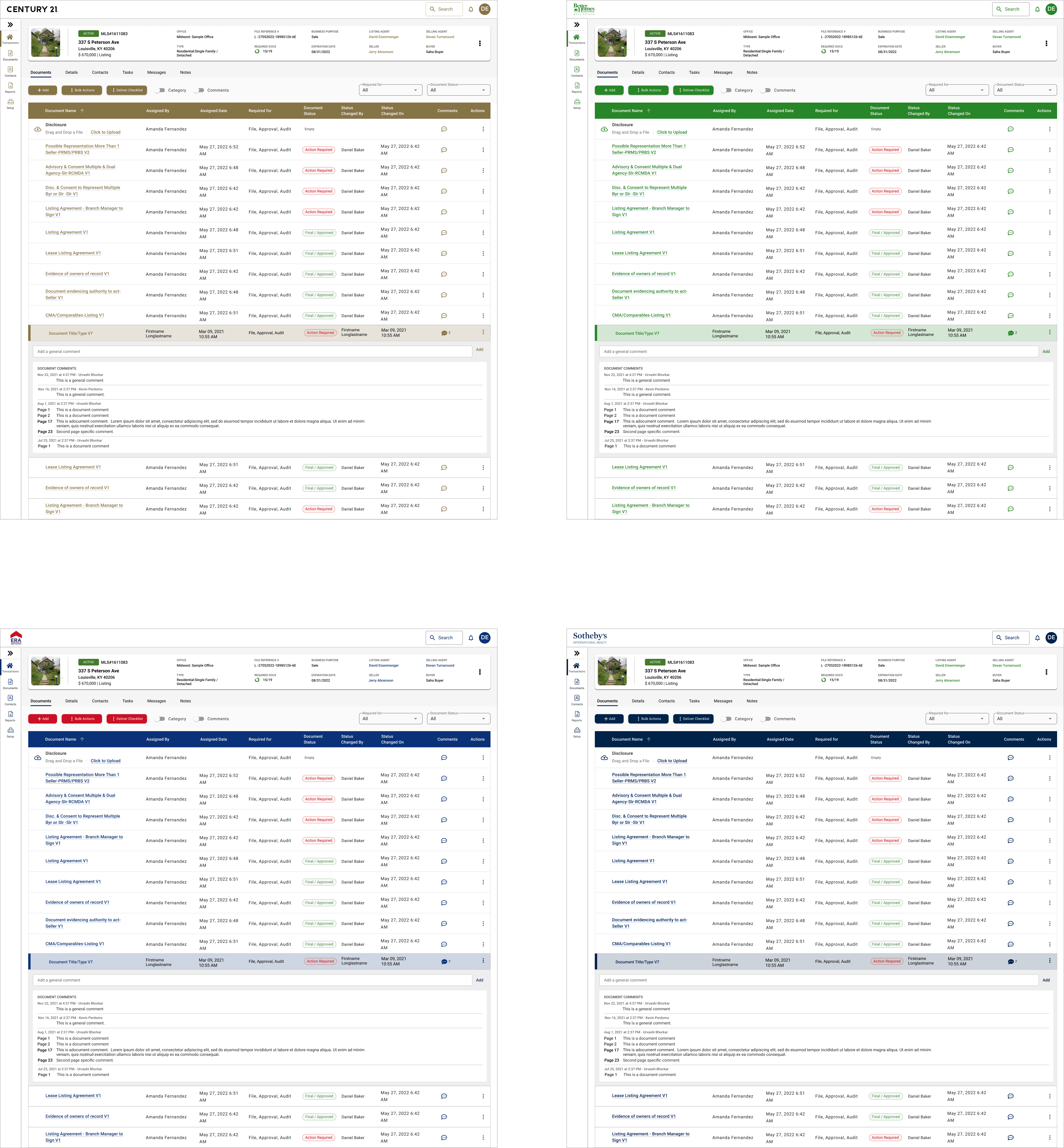
The problems were clear. Users couldn't find files quickly. The dashboard was messy and required opening documents just to see basic information like status or file names. Navigation was confusing with too many options. And because there was no design system, every franchise brand (Coldwell Banker, Century 21, ERA, Sotheby's) had slightly different interfaces, forcing users to relearn the platform when switching offices.
One agent with 8 years of experience told me, "I spend half my time just trying to find where to upload documents. The interface is so confusing—I've been using this for years and still get lost."
An office administrator managing multiple locations added, "Every franchise brand has slightly different buttons and layouts. When agents switch offices, they have to relearn everything."
The Design: Building a System for Everyone
The core challenge was creating a design system that could translate across multiple franchise brands. Each brand (Coldwell Banker, Century 21, ERA, Sotheby's) needed to maintain their own identity while using the same platform. Users would log in and see their brand reflected in colors and logos, but the interface, components, and workflows had to remain consistent.
Design System Foundation
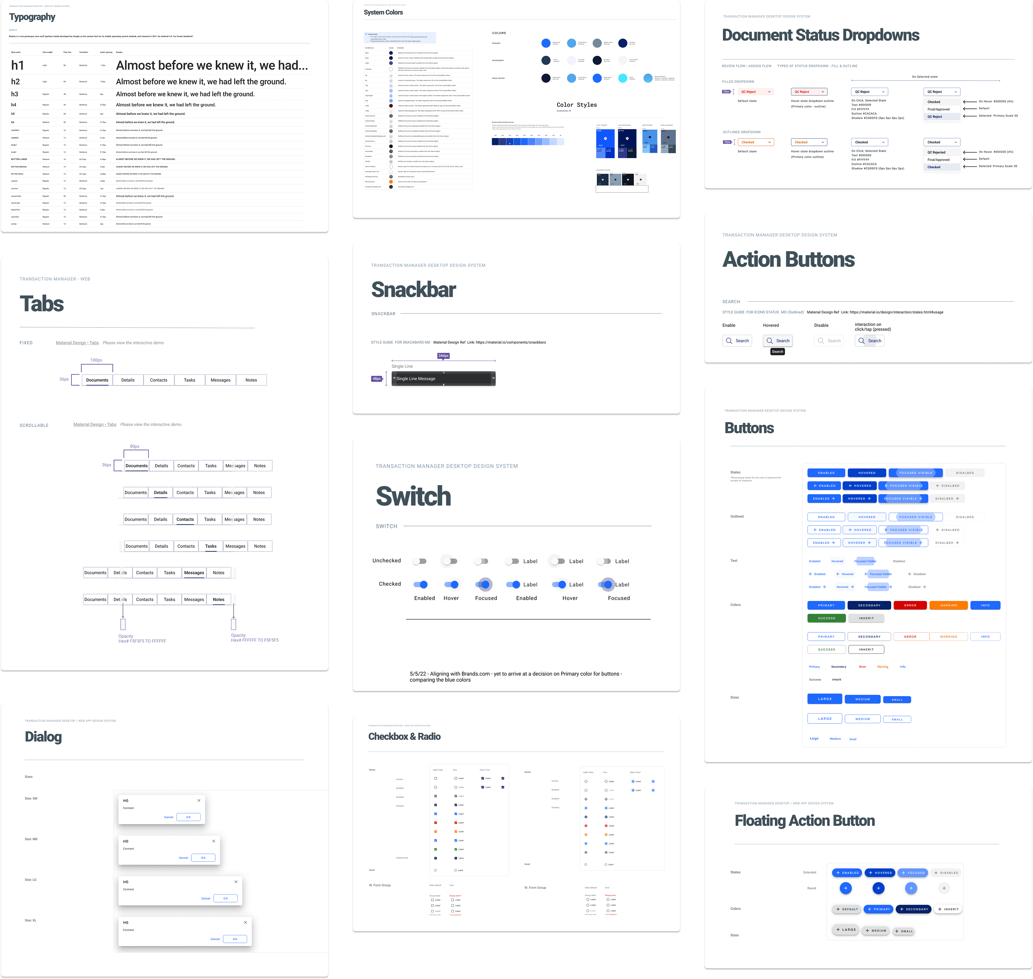
I built Transaction Manager's first comprehensive design system from scratch:
Colors: Brand palette that could adapt to each franchise, semantic colors for success/warning/error states, neutral grays for backgrounds and text, all WCAG AA compliant
Typography: Consistent heading scale, 16px base for readability, clear hierarchy
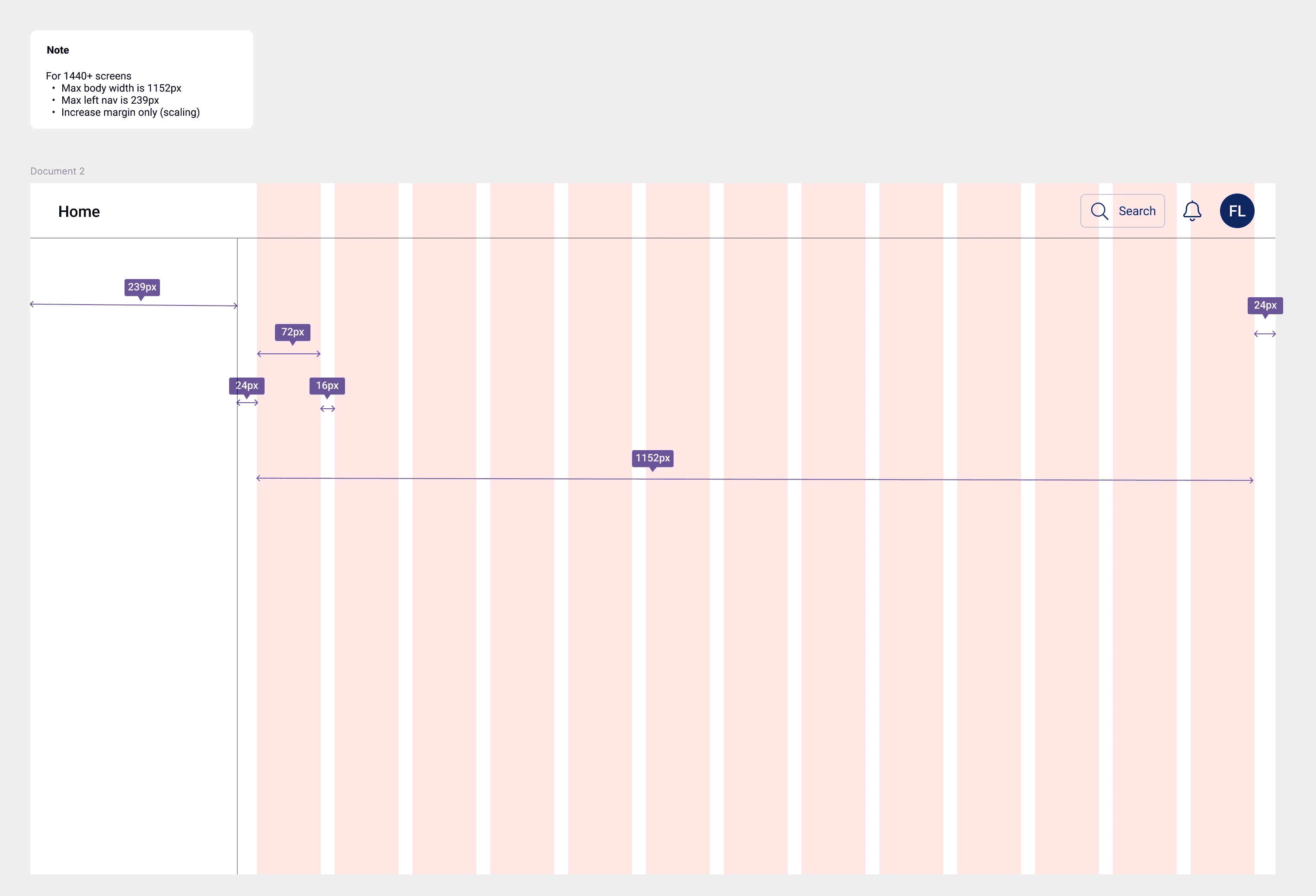
Spacing: 4px base unit with 8px, 16px, 24px, 32px scale for consistent padding and margins
Components: 80+ reusable components including buttons, forms, tables, cards, modals
Icons: 200+ custom icons with consistent style
Dashboard Redesign
The old dashboard was cluttered and forced users to open files just to see basic information. I redesigned it with a clean table view that displayed:
File names
Status (active, pending, closed)
Last updated date
Assigned agent
Key actions (edit, download, share)
Users could now see everything they needed at a glance without opening individual files.
Simplified Navigation
I reduced navigation from 20+ menu items down to 6 primary categories, making key features easier to find.
Streamlined Workflows
Document upload went from 6 steps to 2 with drag-and-drop functionality. Other critical tasks were simplified with clear visual hierarchy guiding users to primary actions.
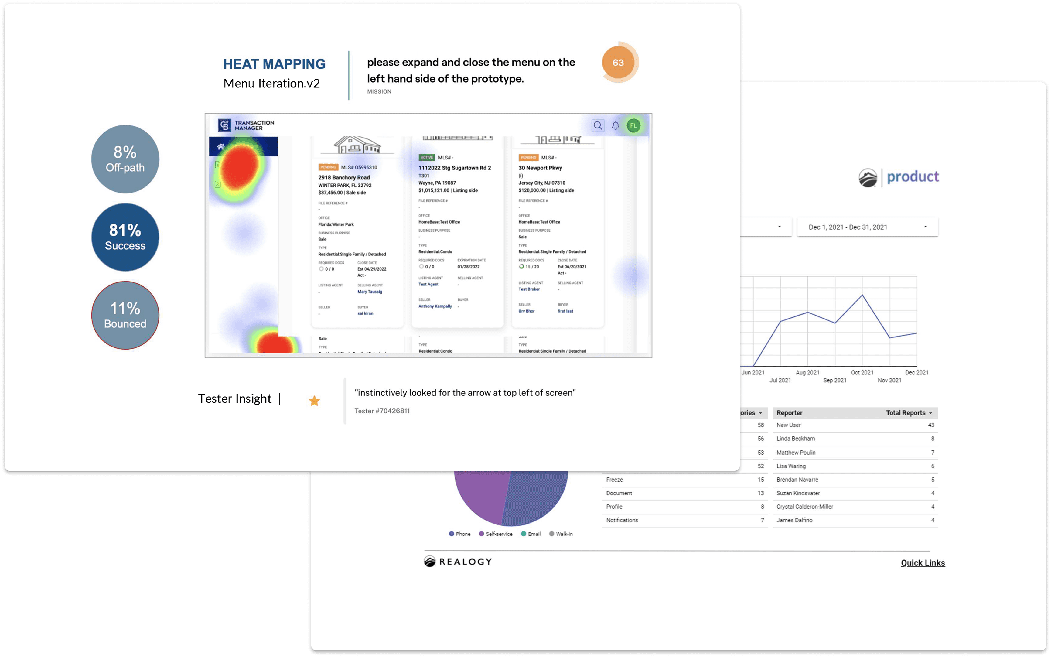
Test: Validating with Real Users
I ran 3 rounds of usability testing with 8 participants per round (24 total), mixing experienced users and new agents. I gave them tasks like uploading documents, updating deal stages, finding specific transactions, and completing task lists.
What changed based on testing:
Table view information
Initial designs showed limited file details. Users needed more context without clicking through. I added status indicators, timestamps, and quick actions directly in the table.
Brand customization
Testing with users from different franchises revealed that while they wanted brand consistency, certain elements (like primary button colors) needed to match their franchise identity. I adjusted the design system to allow brand color overrides while maintaining component structure.
Navigation clarity
Users initially struggled with category labels. I simplified language and reorganized groupings based on how users actually thought about their work.
Error handling
Testing revealed that error messages weren't clear enough. I rewrote them in plain language and added visual indicators showing exactly where problems occurred.
Impact
The Transaction Manager redesign proved that a solid design system transforms not just user experience but business efficiency. The 35% reduction in support tickets saved the company significant support costs while the 40% faster task completion made agents more productive. Most importantly, the design system reduced design and development time by 50% for new features, creating a scalable foundation that worked across multiple franchise brands without sacrificing consistency.
Reflection
This project reinforced that design systems aren't just about visual consistency; they're about efficiency at scale. Building one system that could adapt to multiple franchise brands while maintaining usability was challenging, but it solved a real business problem. Agents no longer had to relearn the interface when switching offices.
The biggest challenge was balancing brand identity with functional consistency. Each franchise wanted their brand visible, but users needed predictable patterns. Testing showed that maintaining consistent components while allowing brand color customization solved both needs.
If I did this again, I'd involve developers earlier in the design system creation process. Some components required technical adjustments that would've been smoother with earlier collaboration.
The core lesson: messy, developer-designed interfaces aren't just ugly; they're expensive. Poor usability drives up support costs, slows down users, and increases churn. Investing in proper design upfront pays for itself quickly.
Next Steps
Add smart automation to help prioritize tasks
Explore mobile support for on‑the‑go agents
Continue gathering usage data to refine workflows


8 YOE | Figma, WCAG, Design Systems, UX Research | Led B2B SaaS & e-comm products for 1M+ users | AI Certified


