Bravecto Calculator

Merck Animal Health Pharmaceuticals Lead UI/UX Designer Tablet
Overview
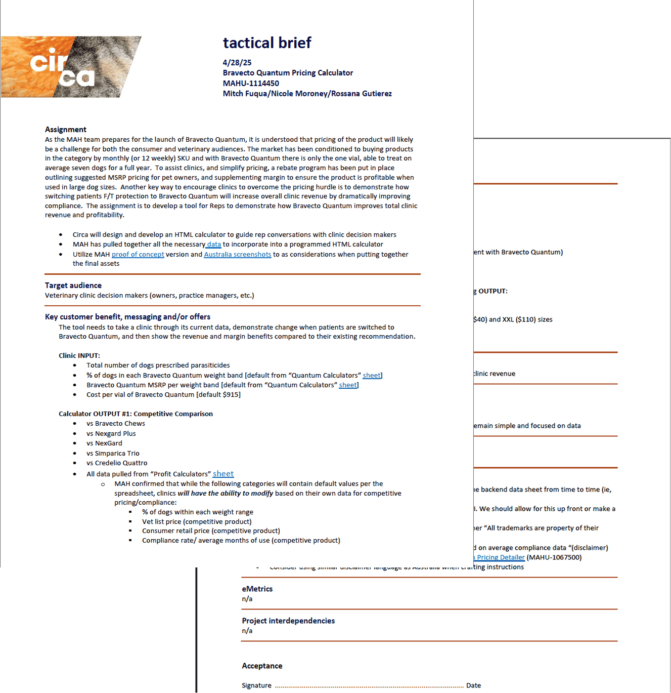
Merck Animal Health needed a better way for sales representatives to demonstrate the revenue potential of Bravecto, a flea and tick preventive for dogs, during live clinic visits.
The original calculator functioned like an Excel sheet. It wasn’t built for tablets, wasn’t optimized for conversation flow, and most users abandoned it before completing a calculation..
Problem
The original calculator created friction at every step:
Single dense screen filled with numeric inputs
Looked and behaved like a spreadsheet
No sense of progress
Poor tablet optimization
Confusing data presentation
Revenue impact buried in dense text
Sales reps reported abandoning the tool mid-conversation. Veterinarians found it slow and unclear. The tool didn’t support real-world clinic interactions.
The Solution (Teaser)
I redesigned the calculator into a guided, step-by-step tablet experience that prioritized clarity, speed, and visual revenue comparison.
Numbered progress steps
Focused input screens
Competitor comparison tabs
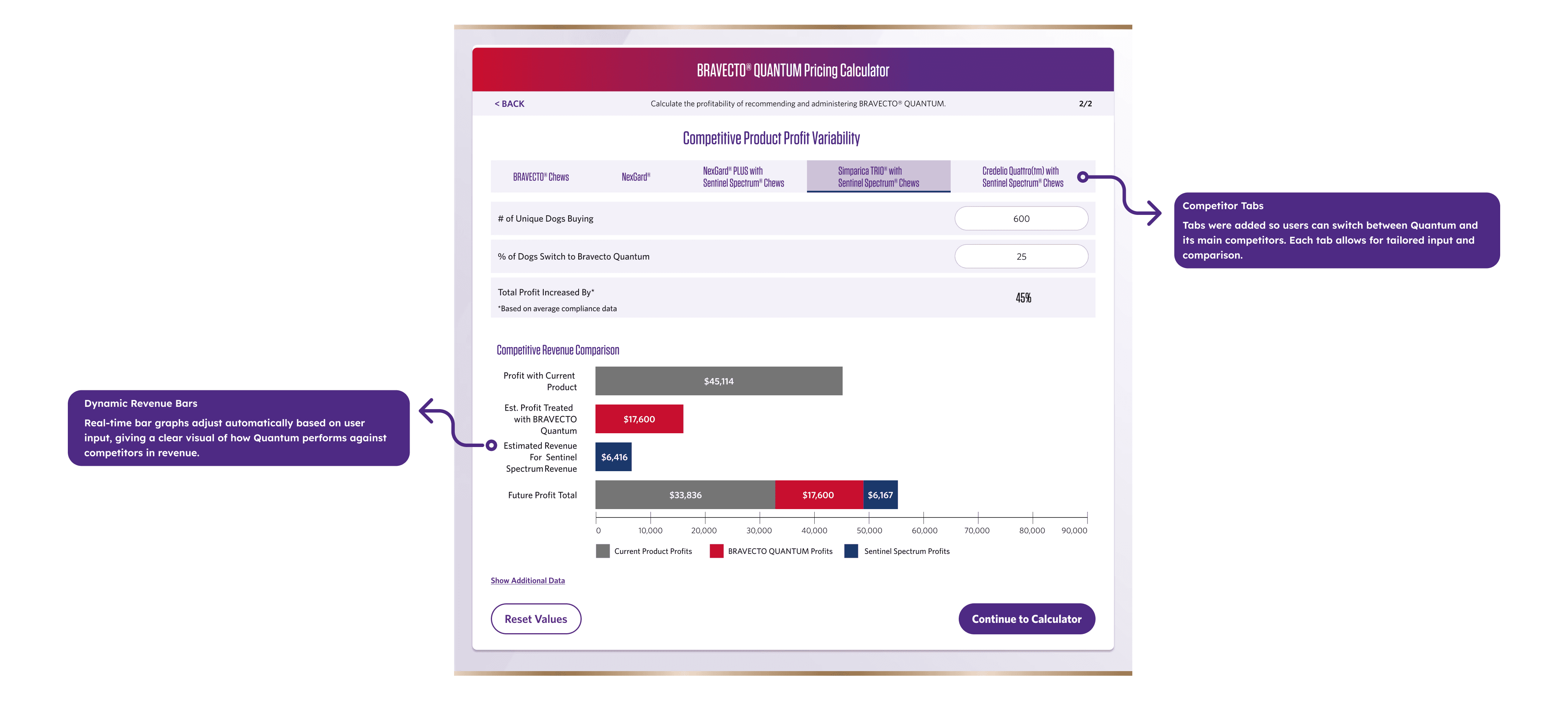
Visual bar charts for instant profit clarity
Touch-optimized components
Results
73% | 44% | 38% | 30% |
|---|---|---|---|
Completion Rate (VS. Previous Tool) | Increase in Rep Outreach Requests | Decreased Average Time Spent on Entry | More engagement |
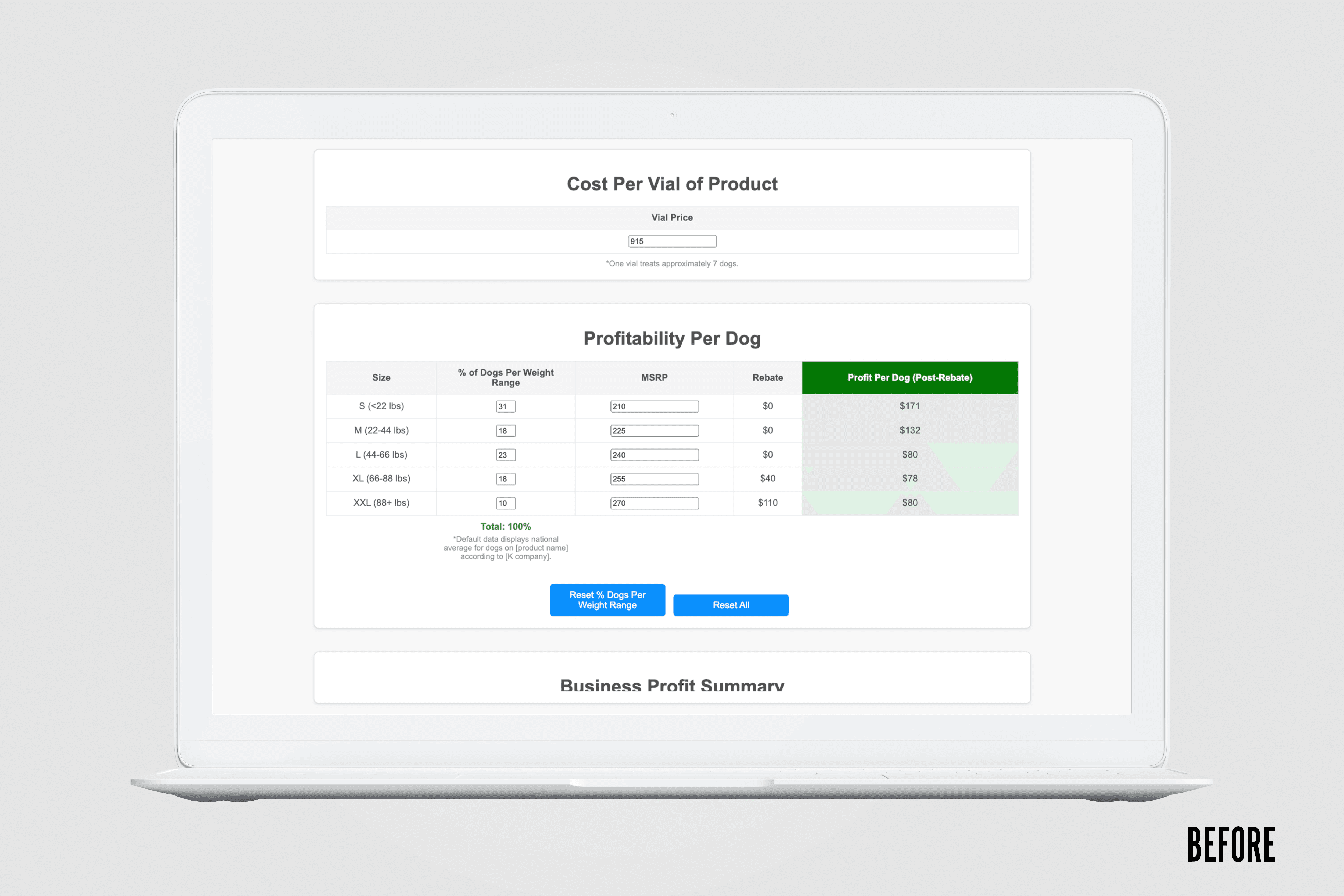
Before
An Excel-like interface that wasn't practical for tablets. Confusing navigation with no sense of progress. Wrong data displayed in unclear ways. Users couldn't tell where they were in the process or understand the results.
After
A clean, tablet-optimized interface with numbered steps showing progress. Clear tabs for competitor comparisons. Visual bar charts making profit differences immediately obvious. Focused inputs on each screen guiding users forward.

Research
I interviewed veterinary staff and shadowed sales reps during clinic visits to observe real usage.
Key insights:
The tool wasn’t built for the tablet context it lived in
Users felt unsure if they were entering correct data
Dense inputs slowed conversations
Results didn’t visually support sales discussions
The problem wasn’t just aesthetics — it was context mismatch.
Ideation
Reframing the Experience
I facilitated collaborative workshops with stakeholders to align on what needed to change.
Core decisions:
Break the experience into guided steps
Introduce competitor tabs for clarity
Replace dense output text with visual charts
Design exclusively for tablet usage
This required rebuilding from scratch — not just improving the UI.
Design
Structure Before Style
I began with low-fidelity wireframes focused on clarity and flow.
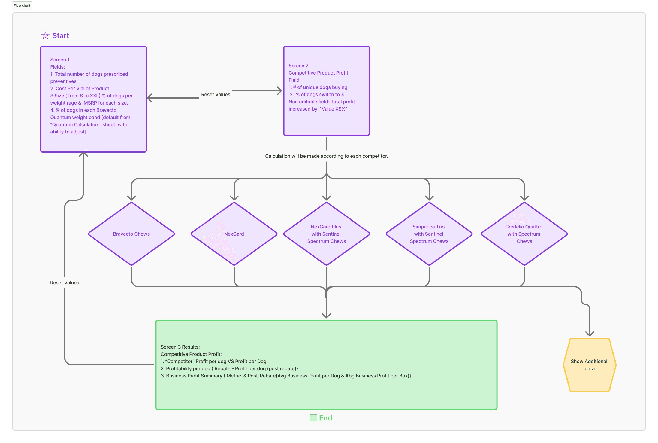
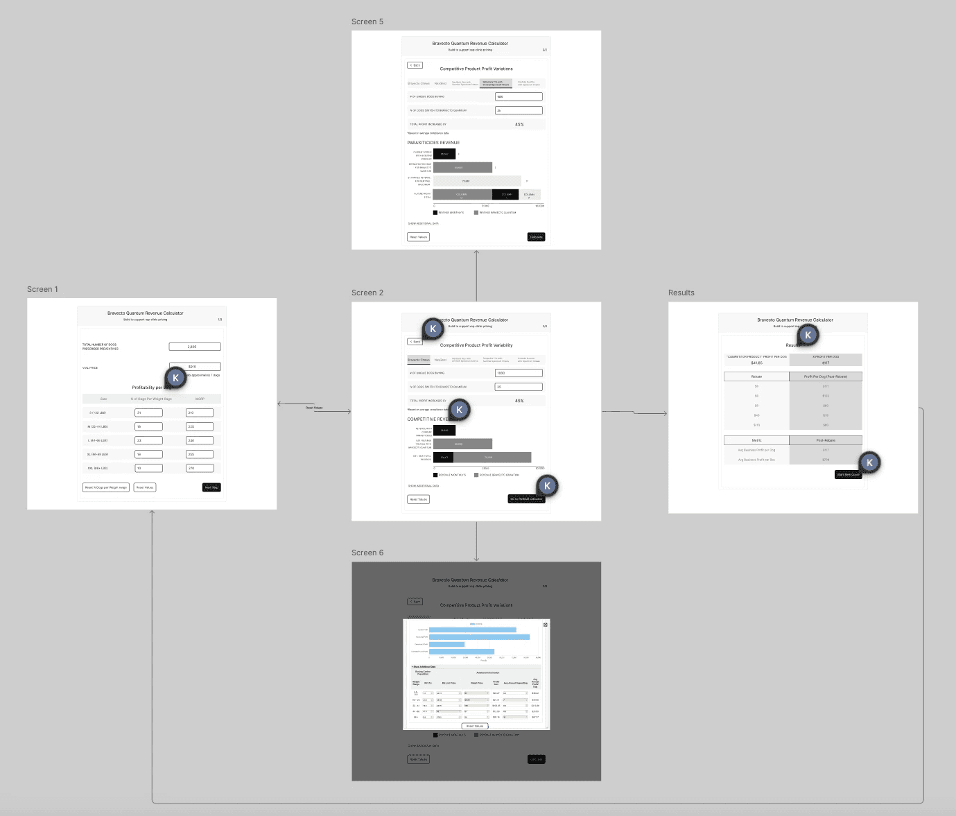
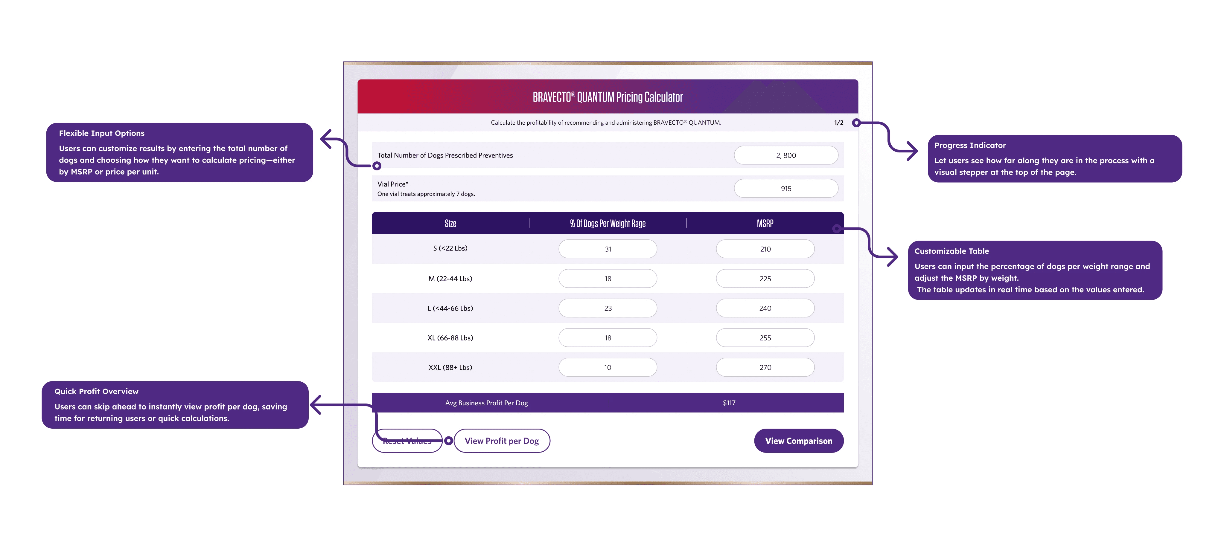
Two-Screen Flow
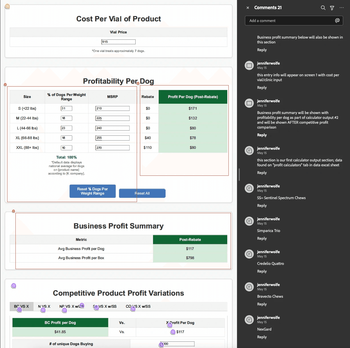
Screen 1 — Input Data
Total number of dogs prescribed preventives
Pricing and weight distribution inputs
Immediate calculation of Average Business Profit per Dog
Screen 2 — Competitor Comparison
Tabbed competitor views
Three bar charts showing revenue differences
Clear visual hierarchy emphasizing profit lift
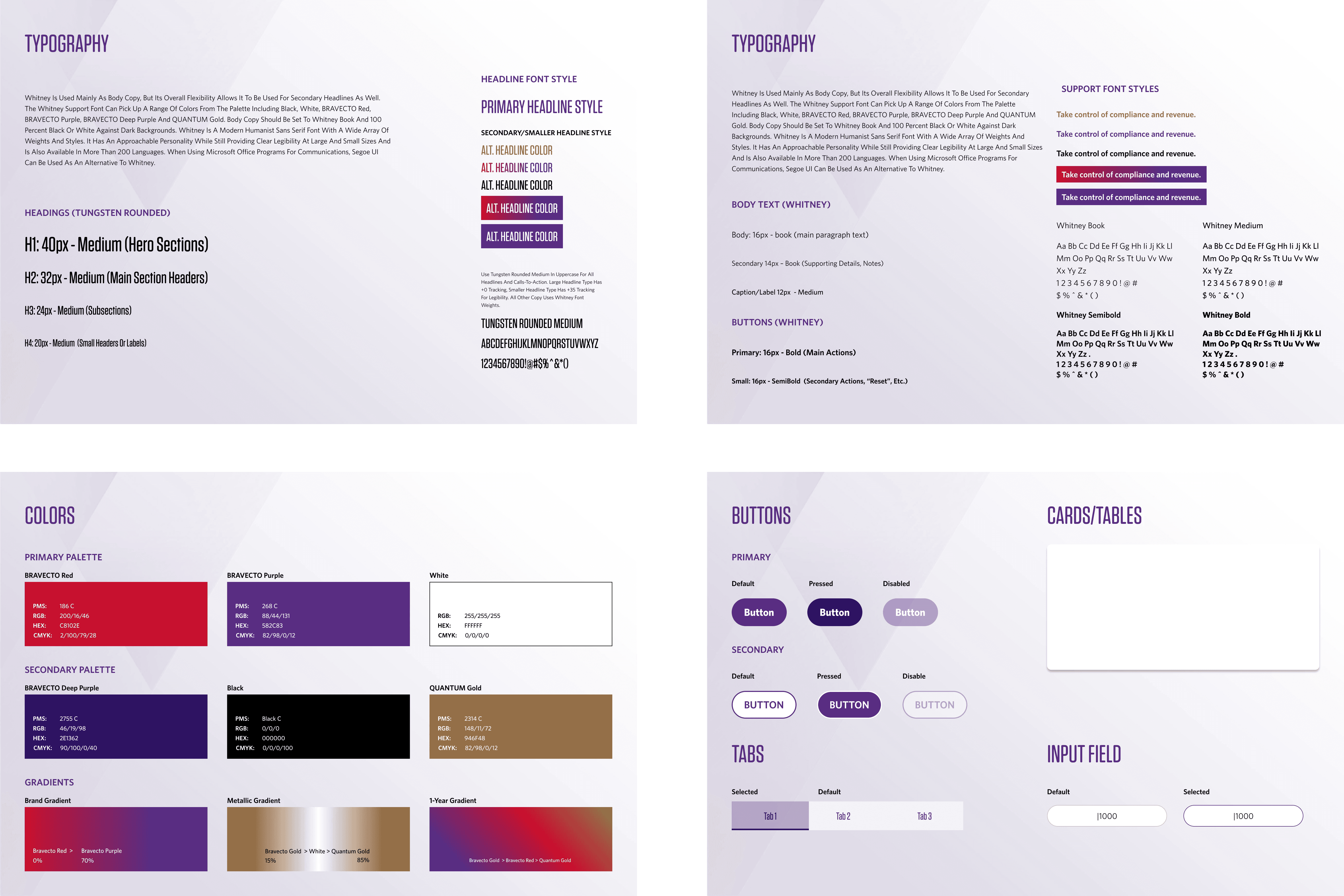
Design System & Visual Theme
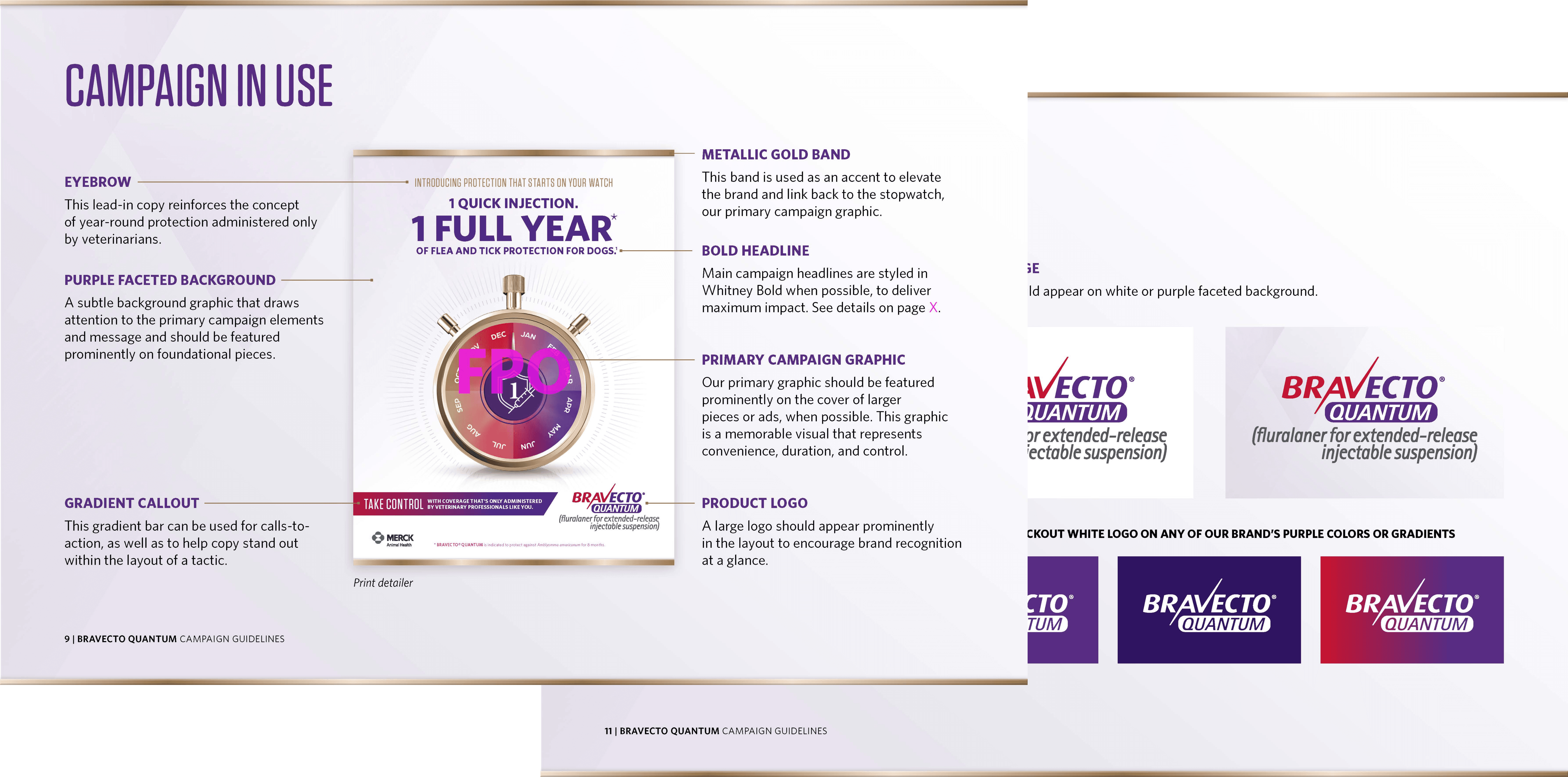
Unlike other projects, there was no existing UI design system for this product — only general brand guidelines created for Bravecto’s marketing campaigns.
Those brand materials were built for print and promotional assets, not for a functional, data-heavy tablet application. That meant I needed to translate a marketing identity into a usable product interface.
Final Product (Conclusion)
Key Improvements
Guided Flow
Clear numbered steps reduced abandonment.
Tablet-First Design
Large touch targets and optimized spacing.
Visual Revenue Clarity
Bar charts made profit differences instantly understandable.
Competitor Comparison Tabs
Side-by-side evaluation without cognitive overload.
Complete Visual Reskin
Consistent, branded, and scalable UI system.
Business Impact
The redesign proved that in high-pressure sales environments, speed and clarity directly impact business outcomes.
Reducing completion time from 5+ minutes to approximately 30 seconds dramatically improved usability.
Sales reps reported:
“I can finally use this in real conversations.”
“The visuals make the revenue impact obvious.”
Higher completion rates and increased outreach requests demonstrated that visual clarity drives follow-up action.
Reflection
This project taught me that sometimes you need to build the foundation before you can solve the problem. Creating a design system from scratch took extra time upfront, but it gave the entire redesign consistency and made development smoother.
The biggest challenge was managing conflicting stakeholder feedback while keeping user needs at the center. Bringing everyone together early and showing research findings helped align the team around what actually mattered.
If I did this again, I'd push for clearer success metrics from the start. We improved the experience significantly, but having harder numbers would've made the impact even clearer.
The core lesson: tools designed for one context (desktop/Excel) rarely work in another (tablet/clinic). You can't just resize. You have to rebuild for the actual use case.


8 YOE | Figma, WCAG, Design Systems, UX Research | Led B2B SaaS & e-comm products for 1M+ users | AI Certified


