Globie

Obie Tel LLC Globie Telecommunications, B2C Mobile
Project Overview
Globie is a telephony app focused on making affordable international calls. At the time, the app's UI was outdated and visually overwhelming, making it difficult for users to navigate, manage calls, and complete basic tasks. The product struggled to deliver on its core promise: helping users make calls quickly and easily.
The Problem
The interface was cluttered with unclear navigation. Users struggled to find key actions like adding funds or making calls. There was no onboarding to guide new users. The calling flow had too many steps, causing drop-offs. The visual design felt outdated and didn't reflect the friendly, approachable brand Globie wanted to be.
The Goal
Simplify the calling experience and improve usability so users could navigate with less friction, complete calls more easily, and feel confident using the app.
Solution
To address the challenges in Globie, we delivered a full redesign focused on clarity, usability, and engagement:
Simplified Navigation: Reorganized menus and key actions so users could add funds, search contacts, and make calls in fewer steps.
Guided Onboarding: Introduced an optional tutorial to teach new users how to navigate the app quickly, with tips for frequent users to skip it.
Streamlined Call Flow: Redesigned the registration-to-call journey to reduce friction and improve task completion.
Interactive & Fun Elements: Added features like the pull-down contact wheel for faster searching and playful animations aligned with the Globie brand.
Accessibility & Dark Mode: Ensured WCAG AA contrast standards, added dark mode to reduce eye strain and improve battery life.
Brand Identity Integration: Incorporated the friendly Globie mascot and bright, approachable color palette throughout the app for a cohesive and memorable experience.
This solution made the app easier to use, more engaging, and aligned with Globie’s mission of providing accessible, global communication.
My Contribution
Built sitemap, wireframes, UI kit
Designed responsive layouts for all screen sizes
Defined content strategy with interactive elements
Led UX and UI design end-to-end
Results
25% | 15% | 20% | 18% |
|---|---|---|---|
Increase in user retention | Improvement in call completion rate | Growth in user acquisition (Philippines) | Projected annual revenue increase |
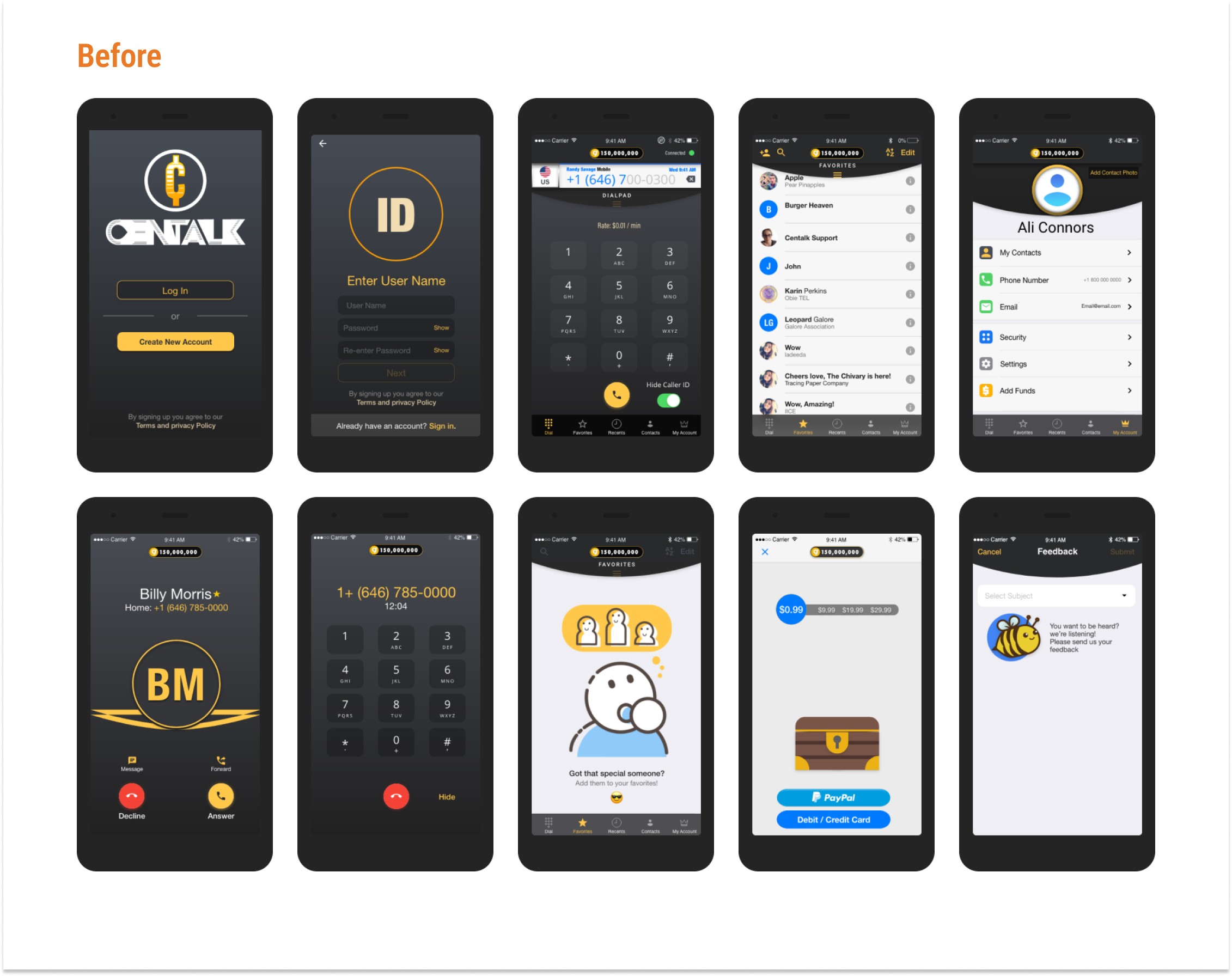
Before
An outdated mobile UI with cluttered screens, unclear navigation, and no guided onboarding. Users struggled to find key actions like adding funds or making a call, leading to drop-offs and incomplete calls.
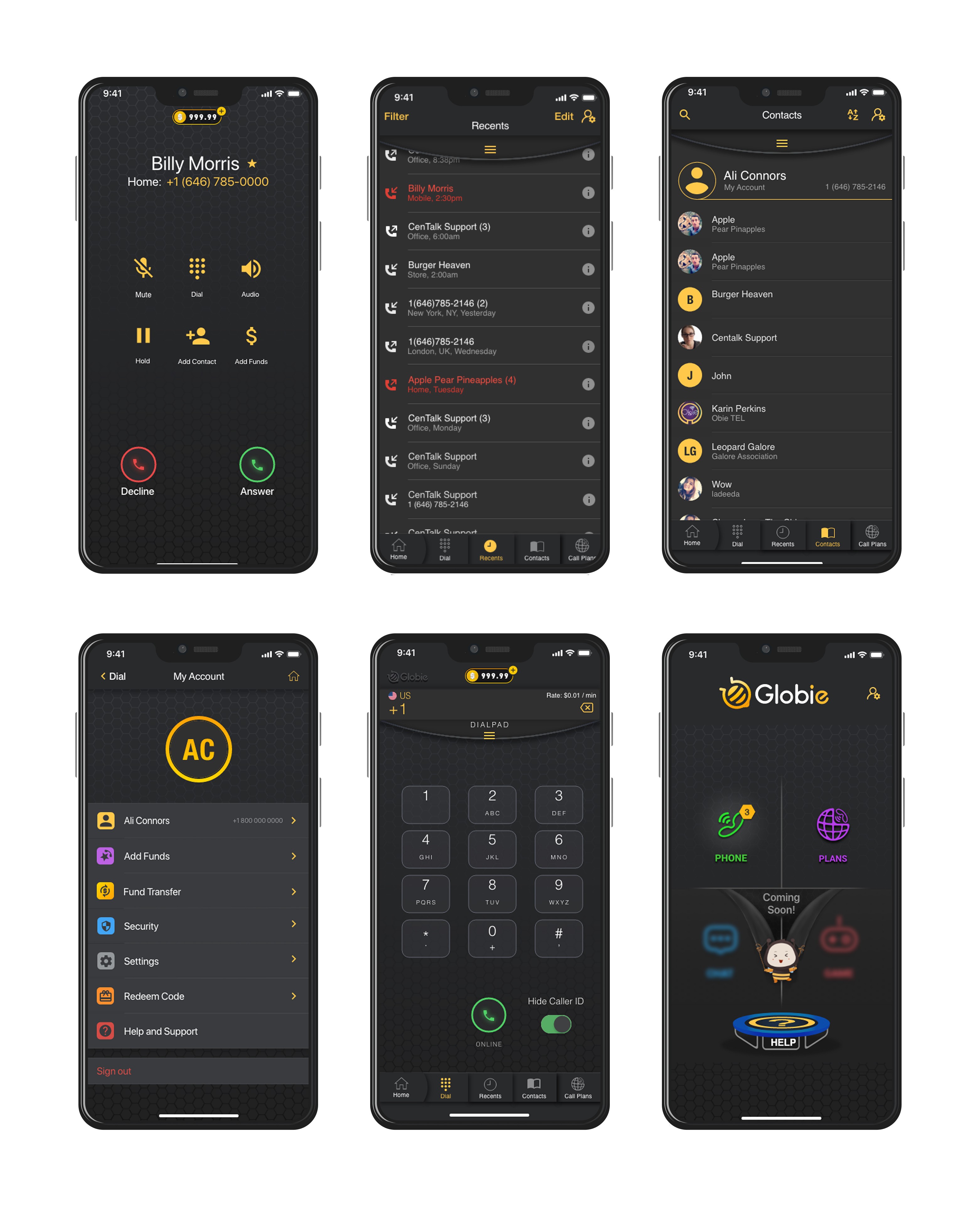
After
A simplified, modern mobile experience with clear navigation, guided onboarding, and a streamlined call flow. Improved usability, faster task completion, and engaging features like the swipe contact search made calling quick and fun.
My Approach
Insights & Idea: Finding the Friction
I started by reviewing user feedback and analyzing where people were getting stuck. I worked closely with product managers and engineers to understand both user needs and business goals. The pattern was clear: users wanted to make calls quickly, but the app was getting in the way.
Navigation was confusing. Visual clutter made it hard to focus on primary actions. New users had no guidance on how to get started. And the calling flow had too many unnecessary steps between wanting to call someone and actually connecting.
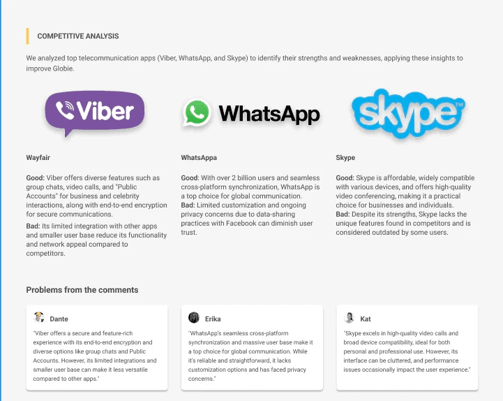
I also looked at competitors to see how other telephony apps handled these problems. What I found was that most focused on functionality but ignored personality. Globie had an opportunity to be both functional and fun.
The idea was to strip away complexity, guide users clearly through their first experience, and add playful elements that made the app feel approachable instead of intimidating.
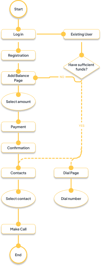
Wireframes & Prototype: Testing the Structure
I translated ideas into low and mid-fidelity wireframes to define structure, user flow, and key interactions. The focus was on simplifying navigation so users could add funds, search contacts, and make calls in fewer steps.
I created interactive prototypes to test core tasks:
Onboarding flow for new users
Adding funds to account
Searching contacts and making a call
Testing revealed where the flow worked and where it didn't. Early feedback helped us remove unnecessary steps, clarify button labels, and refine interactions before committing to final design.
One insight from testing: users didn't want a long tutorial, but they did need initial guidance. The solution was optional onboarding that showed key actions without forcing everyone through it.
UI: Making It Feel Right
Once the flow was validated, I focused on visual direction and consistency. I helped shape Globie's new brand identity with a friendly color palette, approachable typography, and the Globie mascot appearing throughout the app.
Design System
I created a UI style guide to ensure consistency and scalability:
Color palette with WCAG AA compliant contrasts
Typography hierarchy for readability
Component library for buttons, cards, inputs
Icon set with consistent style
Dark mode option to reduce eye strain and improve battery life
Visual Polish
I incorporated the Globie mascot throughout the app to create a cohesive, memorable experience. Bright colors and playful animations made the app feel approachable. Dark mode gave users flexibility for different lighting conditions and preferences.

Onboarding
We added a guided onboarding in the prototype to help new users:
Verify their phone securely
Set a strong password
Learn key actions like adding funds and making a call
Users can skip it if they’re already familiar. This made the first-time experience smoother and faster.

Search Contact Feature
The most engaging addition was the contact search. Instead of a boring list or standard search bar, I designed a dropdown swipe wheel. Users could swipe through contacts in a circular motion to find who they wanted to call.

Impact
The Globie redesign proved that simplifying core workflows while adding personality creates better user experiences and business results. The improved call completion rate and user retention showed that when users can quickly accomplish their goal without confusion, they stick around. The growth in user acquisition, particularly in the Philippines market, demonstrated that a modern, approachable interface helps the product compete in crowded markets.
Reflection
This project taught me that usability and personality aren't opposites. The swipe contact search worked because it was both functional and fun. It solved a real problem (finding contacts quickly) while making the interaction memorable.
The biggest challenge was balancing simplicity with features. Stakeholders wanted to add functionality, but users needed clarity. Testing helped prove that fewer steps and clearer guidance produced better results than more options.
If I did this again, I'd push for more user testing in international markets earlier. The Philippines became a key growth area, and understanding those users' specific needs from the start would've shaped some design decisions differently.
The core lesson: in competitive markets, functional parity isn't enough. Apps need personality and polish to stand out. But that personality has to support the core task, not distract from it.


8 YOE | Figma, WCAG, Design Systems, UX Research | Led B2B SaaS & e-comm products for 1M+ users | AI Certified


