PetsGetAllergies.com

Stallergenes Greer Healthcare Lead UI/UX Designer Desktop & Responsive
Overview
PetsGetAllergies.com is an educational website by Stallergenes Greer for pet owners looking for answers about allergy symptoms and treatment options. The content was medically accurate but hard to use
Problem
The original site created friction at every step:
One long, scroll-heavy page
No real mobile optimization
Dense medical jargon
Hidden CTAs
No clear path to find a vet or explore treatment
Users felt overwhelmed and left before taking action. Bounce rates were high and conversions were low.
The Solution (Teaser)
I transformed the site from a single long page into a multi-page, task-focused experience.
Clear navigation by species and need
Interactive symptom quiz
Medical glossary
Vet finder
Plain-language content
My Contribution
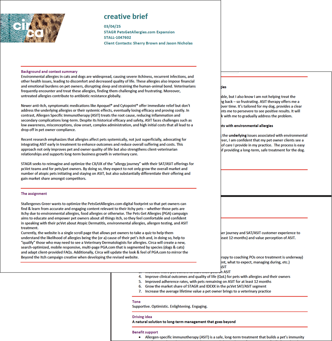
Ran interviews with stakeholders and users
Built sitemap, wireframes, UI kit
Designed responsive layouts for all screen sizes
Defined content strategy with interactive elements
Led UX and UI design end-to-end
Results:
35% | 40% | 2x | 50% |
|---|---|---|---|
Increase in user engagement | Increase in conversion | Faster navigation | Faster navigation |
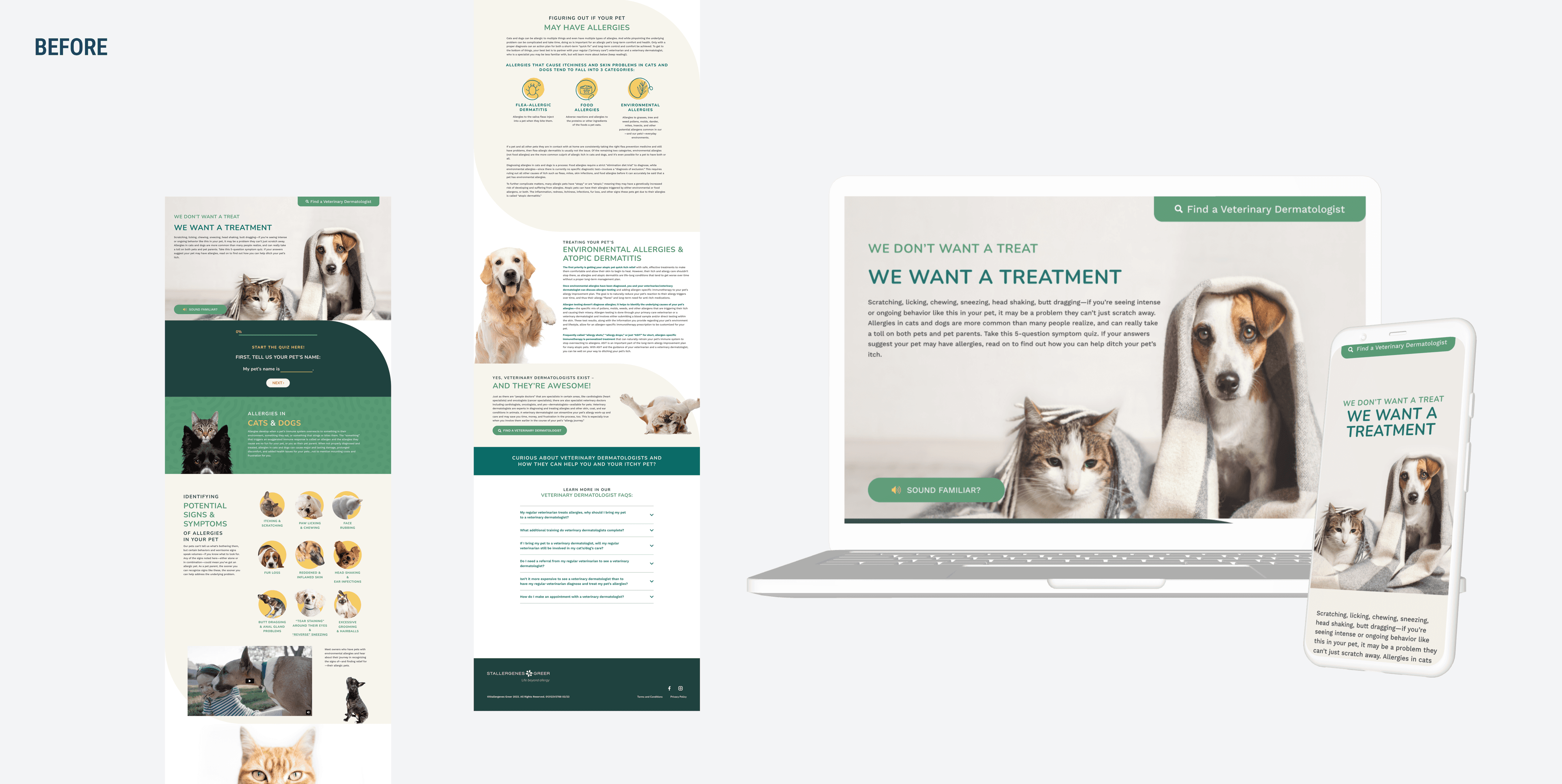
Before
A single-page, scroll-heavy layout with dense paragraphs of medical text. No clear visual hierarchy. Desktop-only experience. Hidden CTAs. Medical jargon throughout.
After
Multi-page, task-focused structure with scannable content and clear sections. Interactive tools including a symptom quiz, glossary, and vet finder. Fully responsive mobile-first design. Prominent CTAs. Plain language with optional technical details.

My Approach
Research
Multi-page, task-focused structure with scannable content and clear sections. Interactive tools including a symptom quiz, glossary, and vet finder. Fully responsive mobile-first design. Prominent CTAs. Plain language with optional technical details.
User Feedback:
"So much easier to find what I need"
"The quiz helped me understand my dog's symptoms"
"I could actually use this on my phone"
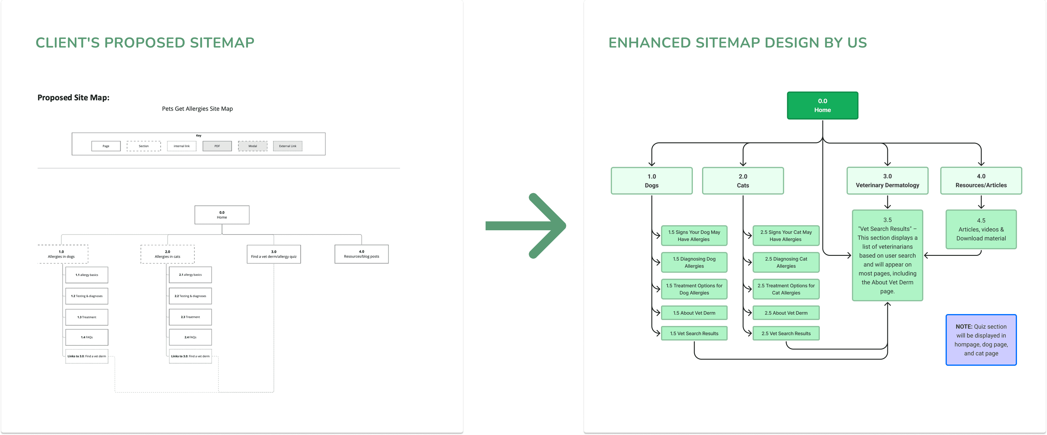
Rethinking Information Architecture
The existing sitemap grouped everything together. It didn’t reflect how users think.
I proposed a new structure:
Separate sections for dog and cat allergies
Dedicated pages for symptoms, testing, and treatment
Clear entry points based on user intent
I created a new sitemap, validated it with stakeholders, and worked with a copywriter to rewrite content in plain language while keeping medical accuracy.
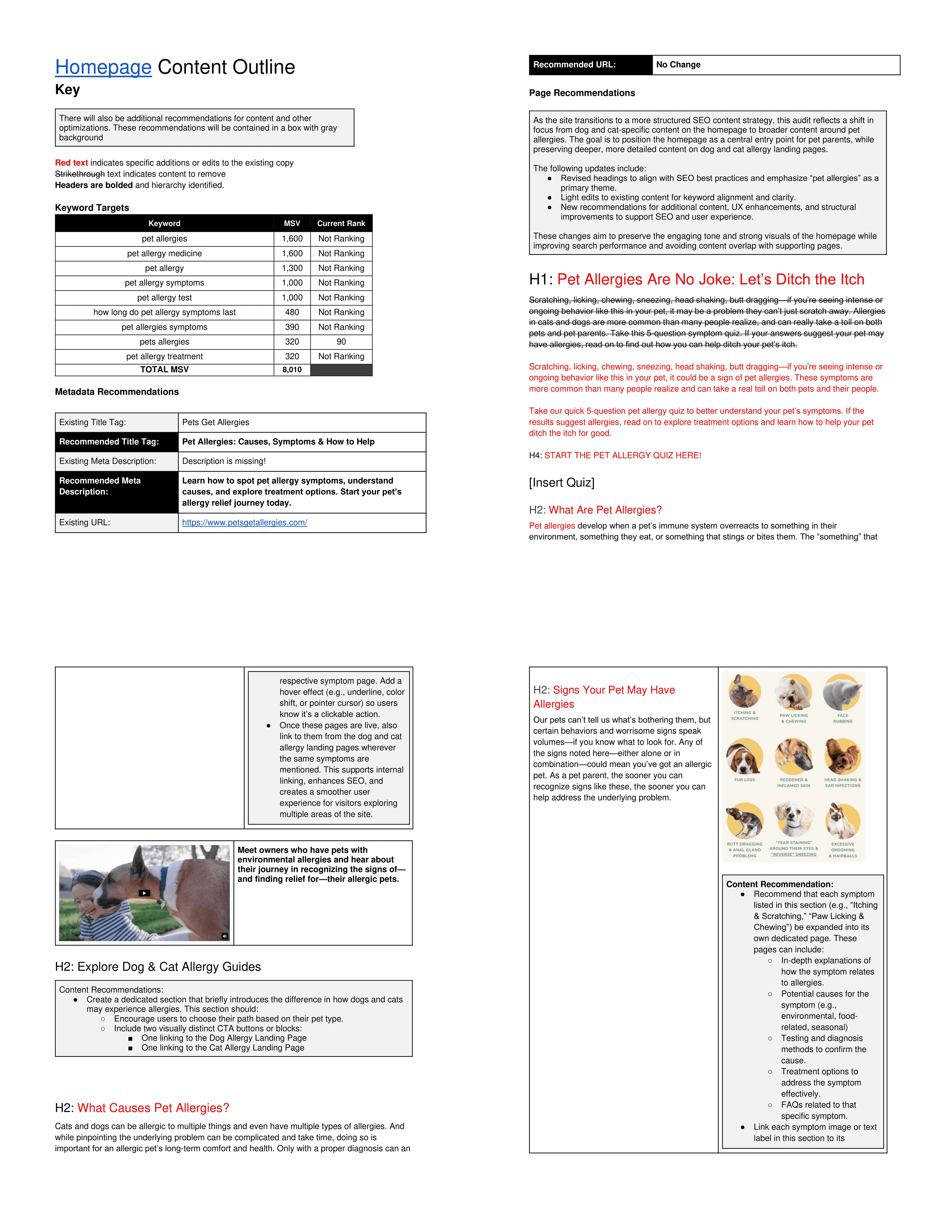
Design
Structure Before Style
I started with wireframes to solve hierarchy first.
Navigation redesign
Added a top tab navigation:
Home, Cat Allergies, Dog Allergies, Veterinary Help, Articles
Users could now jump directly to what mattered.
Side navigation for long pages
Added “On This Page” anchors to break down dense content into scannable sections.
Mobile-first design
Card-based layouts
Accordion patterns to reduce scrolling
Sticky “Find a Vet” CTA on mobile
Mobile was no longer an afterthought. It became the primary experience.
Testing & Iteration
We ran usability testing with real pet owners using task-based scenarios.
What changed after testing:
Quiz Placement
Originally buried in navigation. Most users missed it.
Moved to homepage hero → engagement increased immediately.
Medical Language
Even with a glossary, users felt slowed down. We simplified most content further while keeping accuracy.
“Find a Vet” CTA
Originally in the footer. Hardly used. Made persistent on mobile and more visible on desktop → significant increase in clicks.
Validation methods:
Usability testing
A/B testing homepage layouts
Heatmaps
Stakeholder reviews for medical compliance
Design System & Visual Theme
To ensure consistency and scalability, I created a lightweight design system for the new experience.
A graphic designer introduced a refreshed visual theme aligned with the brand direction. I then translated that theme into a functional UI system and applied it across all wireframes and final screens.
What I defined:
Typography scale for readability (especially on mobile)
Accessible color system with high contrast
Button hierarchy and CTA patterns
Card components for modular content
Accordion and tab patterns for long-form education
Spacing and layout grid for responsive behavior
I reskinned the approved wireframes using this system, making sure the visual layer supported the new structure instead of overpowering it.
The result was a cohesive, accessible, and scalable UI that felt modern and supportive, while staying medically credible.

Conclusion
Key Improvements
Multi-page structure
Content separated by species and user need.
Plain language first
Technical terms available, but not forced.
Clear hierarchy
Large typography, high contrast, scannable sections.
Mobile-first execution
Fully responsive, with action always visible.
Visual refresh
Cleaner aesthetic, real pet imagery, accessible color contrast.
The new design felt less clinical and more supportive.

Business Impact
The redesign proved that clarity drives action in healthcare education.
Users reported:
“So much easier to find what I need.”
“The quiz helped me understand my dog’s symptoms.”
“I could actually use this on my phone.”
When users could quickly find answers without feeling overwhelmed, they took the next step.
Reflection
What I learned
You can’t fix bad IA with visuals. Structure comes first.
In healthcare, clarity builds credibility.
Empathy is as important as accuracy.
Biggest challenge
Balancing medical precision with plain language. Stakeholders were protective of terminology. Testing proved simplification improved trust, not reduced it.


8 YOE | Figma, WCAG, Design Systems, UX Research | Led B2B SaaS & e-comm products for 1M+ users | AI Certified


