HouseTipster

Marble.com E-commerce, B2C Senior UX/UI Designer Desktop, Tablet & Mobile
Project Overview
HouseTipster started as a blog dedicated to interior design, just articles about home décor and furniture trends. The business was growing, and they wanted to monetize by selling furniture and décor directly on the site. My mission was to transform a content-only blog into a full e-commerce platform that could actually sell products.
The Problem
The UI was very outdated. There was no design system, no shopping infrastructure, and no clear way to add products without completely disrupting the blog experience. The site needed to become an e-commerce store while keeping the editorial content that readers valued.
The Goal:
Turn HouseTipster into a functional e-commerce site that sells furniture and décor, while maintaining the blog content that built the audience.
The Solution:
Redesigned the site to blend editorial content with e-commerce functionality, creating clear pathways from inspiration to purchase. Implemented intuitive navigation, integrated product reviews, streamlined checkout, and responsive layouts—resulting in increased engagement, higher returning customer rates, and faster checkout times.
My Contribution
UX research and competitive analysis
User interviews and persona creation
User flows, wireframes, and prototypes
Visual design and responsive layouts
Usability testing and iteration
Collaboration with developers and product stakeholders
Results
35% | 15% | 20% |
|---|---|---|
Engagement Rate | Returning Customer Rate | Faster Checkout Time |
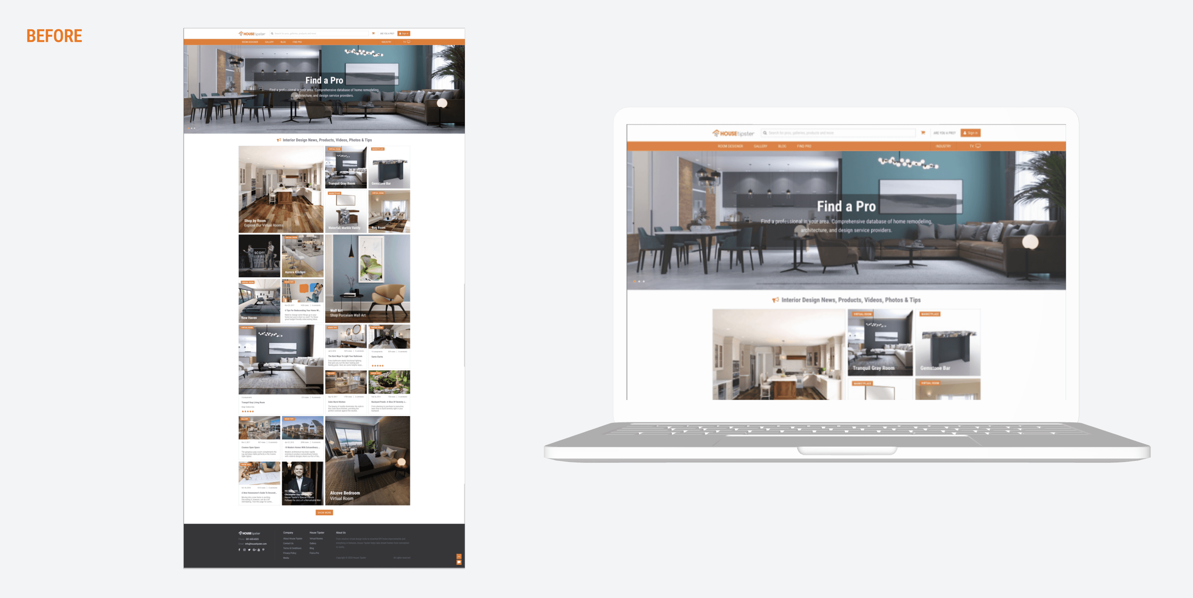
Before
A blog-first site with scattered articles and no way to purchase products. Confusing navigation. Desktop-only optimization. No trust signals like reviews or ratings.
User Feedback:
"I couldn't figure out how to buy the products they mentioned"
"The checkout was too complicated, so I left"
"Doesn't feel like a real store"
After
An integrated platform with clear shopping features. Streamlined 2-step checkout. Product categories and featured items on the homepage. Mobile-optimized responsive design. Reviews and trust signals throughout.
User Feedback:
"I love that I can read their guides and immediately shop the products"
"The checkout is so simple now—I actually completed my purchase"

My Approach
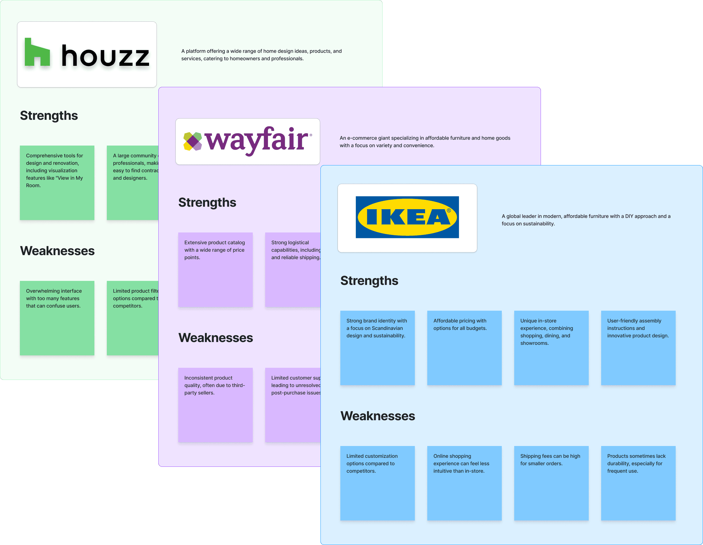
Insights: Learning from the Competition
I started by analyzing competitors to understand what worked in the furniture and home décor e-commerce space. I looked at Houzz, Wayfair, and IKEA to see how they structured their sites, displayed products, and handled checkout.
What I learned:
Wayfair had great commerce but no editorial inspiration
Houzz had strong content but an overwhelming marketplace
IKEA had excellent shopping but limited styling guidance
The opportunity was to blend editorial content with clean, functional e-commerce. HouseTipster already had the content. It just needed the shopping infrastructure.
I also talked to stakeholders to understand business goals and conducted user research to see what readers actually wanted from the site.
Idea: Building a Design System from Scratch
There was no existing design system, so I created one from the ground up using HouseTipster's brand logo as the foundation. I defined typography, color palette, spacing, and component patterns that would work across both editorial content and e-commerce features.
The goal was something clean and sleek that worked for selling furniture while maintaining the editorial feel that readers were used to.
The Design: Clean, Functional E-Commerce
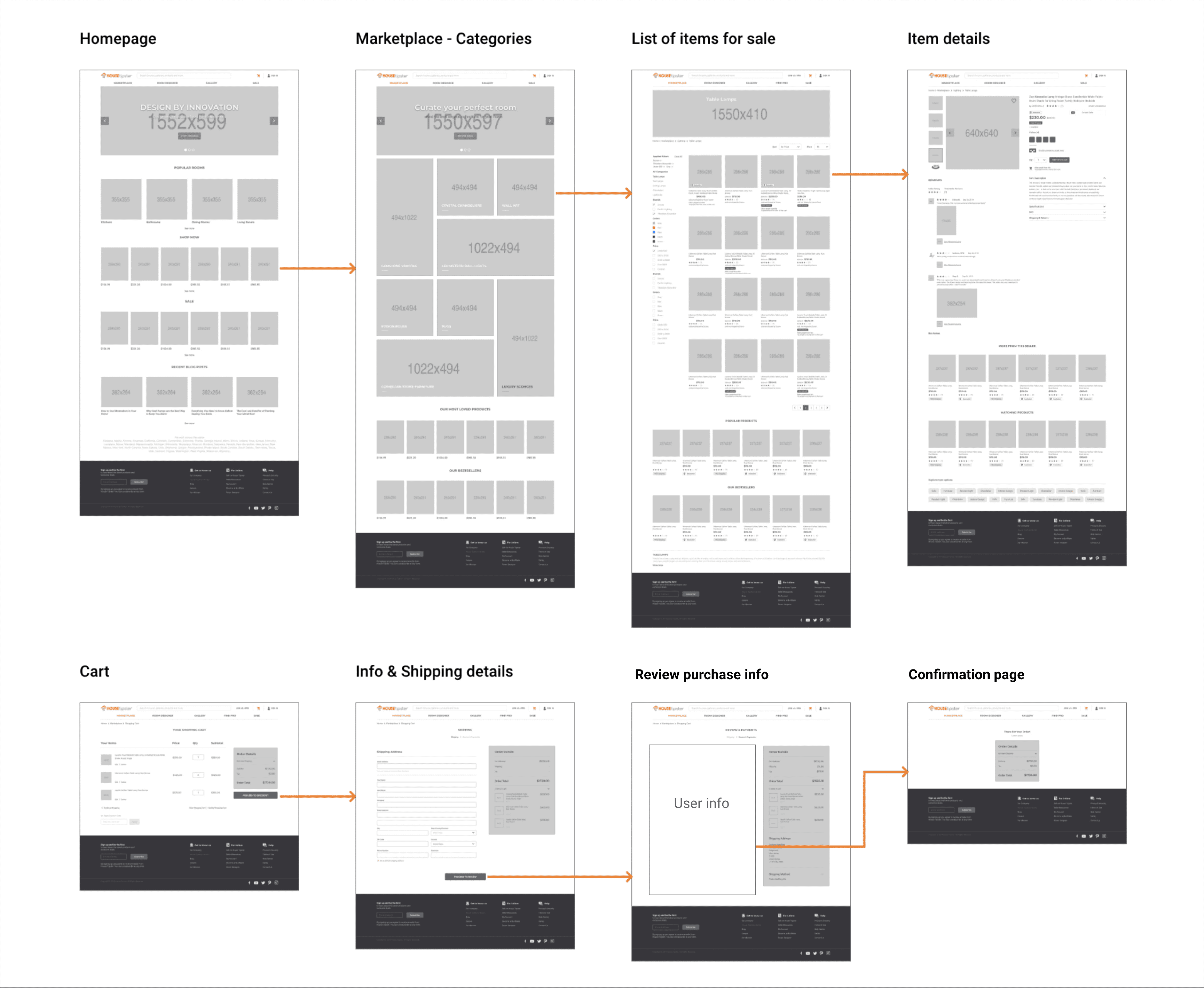
Homepage Structure
I designed the landing page using e-commerce best practices:
Hero banner with featured collections
Product categories for easy browsing
Featured products grid
Company values section
Customer reviews for trust
Contact information
Navigation & Categories
I added clear product categories so users could filter by furniture type, room, or style. This made product discovery straightforward instead of forcing users to scroll through blog posts hoping to find something to buy.
Product Detail Pages
Each product page included:
Multiple product images
Detailed descriptions and specifications
Pricing and availability
Customer reviews and ratings
"Add to Cart" CTA
Related products
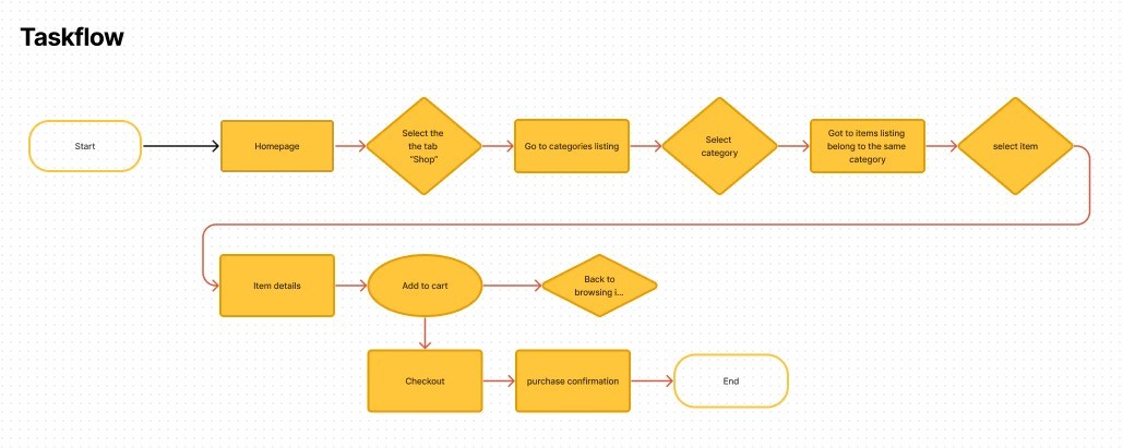
Streamlined 2-Step Checkout
I simplified checkout to just two steps:
Step 1: Review cart, see all product info, fill out personal and shipping details
Step 2: Confirm order and payment, receive receipt with order summary
This reduced friction compared to the complicated multi-step flows common in e-commerce.
Mobile Optimization
Lots of users shop on their phones, so I made sure everything worked seamlessly on mobile. The design system adapted to smaller screens with touch-optimized elements, simplified navigation, and a mobile-first checkout flow.
The Blog
This was a point of tension. Stakeholders wanted to keep the blog but didn't have a strong grasp of UX and UI priorities. I had to showcase data proving that while the blog built audience, the primary revenue driver needed to be shopping.
We kept the blog but moved it to a separate tab in the navigation. It stayed accessible but didn't interfere with the main shopping experience. This balanced stakeholder concerns with business goals.
Test & Iterate: Proving Decisions with Data
I ran usability testing with both existing blog readers and new shoppers. The feedback showed where the design worked and where it needed refinement.
Key changes based on testing:
Navigation clarity
Users initially struggled to understand how shopping and content connected. I restructured navigation to make shopping primary while keeping content accessible.
Product card information
Early versions showed minimal product info. Users needed more context. I added quick view options, ratings, and clearer pricing.
Checkout simplification
Testing revealed that multi-step checkout caused abandonment. Reducing to 2 steps dramatically improved completion rates.
Mobile filtering
Desktop-style sidebar filters didn't work on mobile. I redesigned them as bottom drawer filters with clear apply/reset actions.
Trust signals
Users were hesitant to buy without reviews. Adding customer reviews and ratings throughout the site increased confidence and conversions.
Throughout the process, I had to continuously defend design decisions with stakeholder feedback. Many wanted changes based on personal preference rather than user needs. I relied on testing data and analytics to show what actually worked.

Impact
The transformation proved you can successfully add e-commerce to an editorial brand without destroying what made it valuable. The 40-point reduction in cart abandonment and increase in returning customers showed that when users feel supported from discovery to purchase, they become loyal to the brand. Building a complete design system and mobile-first experience wasn't optional; it was the baseline for credibility.
Reflection
This project taught me that building e-commerce functionality into an existing editorial brand requires balancing two very different needs. The blog built trust and audience. The store needed to drive revenue. Both had to coexist without cannibalizing each other.
The biggest challenge was managing stakeholder expectations. People who don't work in UX often have strong opinions about design without understanding user behavior. I learned to let data do the talking. When stakeholders pushed back on design decisions, I showed them testing results and analytics instead of arguing subjectively.
Creating a design system from scratch gave the entire project consistency and made development smoother. It also made future updates easier since everything followed the same patterns.
If I did this again, I'd push for clearer prioritization earlier. Too much time was spent debating whether the blog or store should be primary. User research and business goals both pointed to e-commerce, but stakeholder attachment to the blog created unnecessary friction.
The core lesson: when adding commerce to content, the shopping experience has to be genuinely good. Half-measures don't work. Users can tell when e-commerce is an afterthought, and they'll abandon the site for competitors who got it right.


8 YOE | Figma, WCAG, Design Systems, UX Research | Led B2B SaaS & e-comm products for 1M+ users | AI Certified


