
Transaction Manager
<!--
Project Details
-->
Client:
Anywhere're
Industry:
Real Estate, B2B
Role:
UX/UI Design
Year:
2022
Platform:
Web App
Project Overview
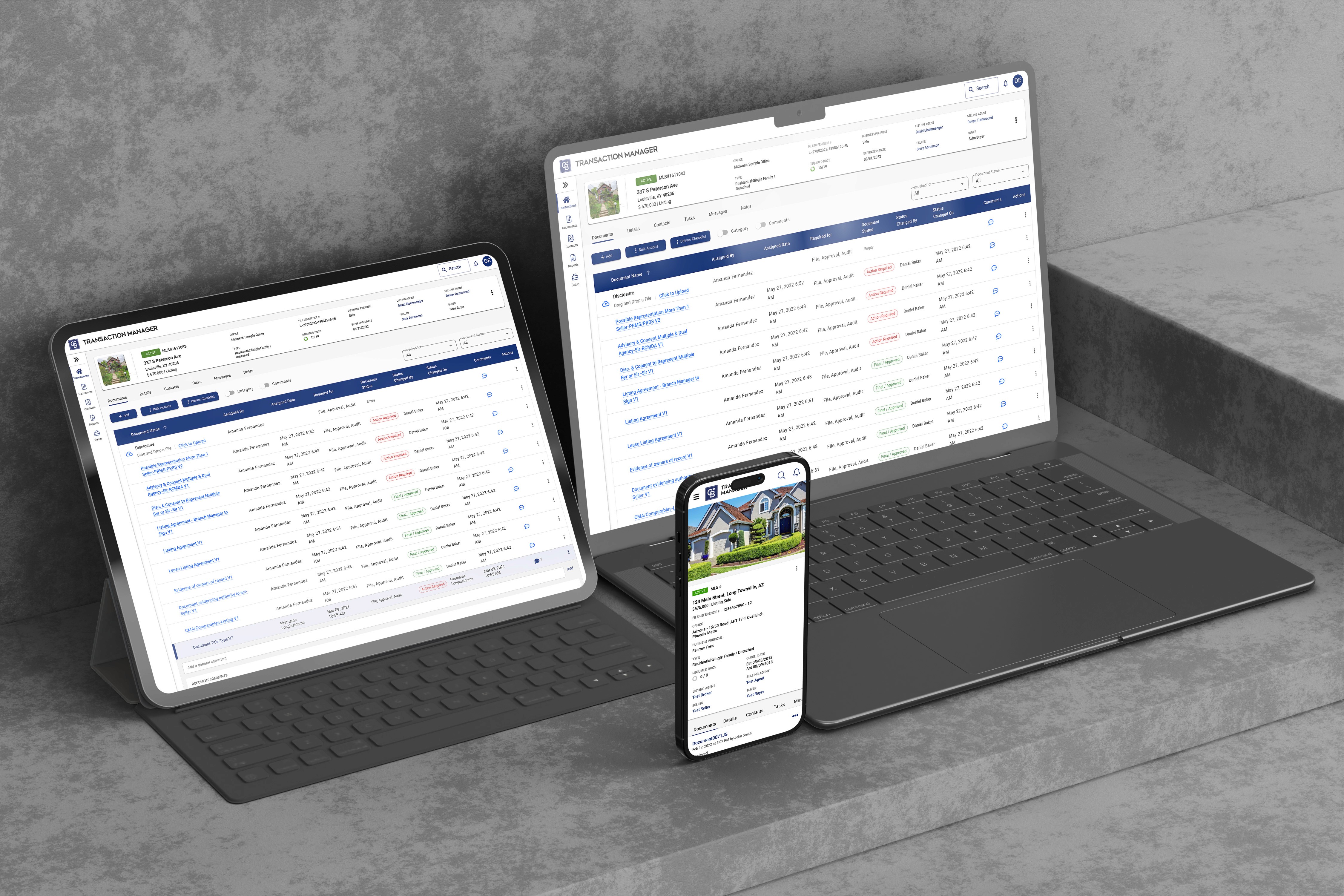
Transaction Manager is a web-based SaaS platform that helps real estate professionals manage deals, documents, and transaction workflows across multiple franchise brands. The existing product suffered from outdated UI, inconsistent patterns, and slow workflows—making it difficult for agents and admins to complete time-sensitive tasks efficiently.
The Problem
Outdated, confusing interface with poor visual hierarchy
Inconsistent branding and UI patterns across franchise brands
No design system—every component built from scratch, leading to inefficiency
Slow, multi-step workflows for critical tasks (uploading documents, managing deal stages)
Complex navigation made it hard to find key features
High support ticket volume due to usability issues
Low user satisfaction scores from frustrated agents
The Goal
Redesign the platform with a unified design system to improve usability, speed up task completion, reduce support burden, and create scalable components for future product growth.
The Solution
Created Transaction Manager's first comprehensive design system and redesigned core workflows with modern UI, clear hierarchy, and intuitive patterns—resulting in higher user satisfaction, faster task completion, and fewer support tickets.
My Contribution
Led UX research with real users (agents, office admins)
Built a design system (components, patterns, accessibility)
Designed improved UI flows for key tasks (uploading documents, task lists, deal overview)
Prototyped and tested solutions in high fidelity
Worked with developers through weekly feedback loops
Results
Before
Outdated interface with usability issues:
Confusing navigation with 20+ menu items
Inconsistent UI patterns across franchise brands
Slow, multi-step workflows (6 steps to upload document)
No visual hierarchy—everything looked equally important
Generic, outdated visual design
High cognitive load for users
Support tickets flooded with "how do I..." questions
User Feedback: "I spend half my time just trying to find where to upload documents"
"Every franchise brand has different buttons—I have to relearn everything"
"The interface is so confusing, I avoid using certain features"

After
Modern, unified interface with clear usability:
Simplified navigation with 6 primary categories
Consistent design system across all brands
Fast, intuitive workflows (2 steps to upload document)
Clear visual hierarchy guiding users to key actions
Modern, clean UI with improved readability
Reduced cognitive load through consistency
Support tickets focused on real issues, not basic usage
User Feedback: "Much easier to find files, and the UI looks sleek and clean." — Erica, Realtor
"The drag-and-drop upload is a game changer—saves me so much time"
"Finally feels like modern software"

My Approach
01 — Discovery
Stakeholder Alignment:
Conducted workshops with Product Managers to understand business priorities
Interviewed engineering team about technical constraints and legacy code challenges
Met with customer support to identify top user pain points from ticket data
Reviewed competitive landscape (Dotloop, SkySlope, Zipform)
User Research:
Interviewed 10 real estate professionals (6 agents, 4 office admins)
Shadowed 3 agents during actual transaction management workflows
Analyzed 6 months of support tickets to identify recurring issues
Reviewed session recordings (Hotjar) showing user struggles
Key Insights:
"I spend half my time just trying to find where to upload documents. The interface is so confusing—I've been using this for years and still get lost."
— Real estate agent, 8 years experience
"Every franchise brand has slightly different buttons and layouts. When agents switch offices, they have to relearn everything."
— Office administrator managing multiple locations
Research Findings:
Navigation confusion: 78% of users struggled to locate key features within 2 minutes
Workflow inefficiency: Document upload took average 6 steps (should be 2-3)
Visual inconsistency: 5 different button styles across platform
Support burden: 40% of tickets related to "how do I..." questions (findability issues)
Brand fragmentation: Inconsistent UI across franchise brands caused relearning
Task completion: Critical workflows (deal creation, document management) took 3x longer than industry benchmarks
Mobile gap: 30% of users attempted mobile access, but platform wasn't responsive
User Types Identified:
Real Estate Agent: Primary user, manages multiple deals simultaneously, time-sensitive tasks
Office Administrator: Oversees transactions for entire office, needs bulk actions and reporting
Broker/Manager: Reviews deals, approves actions, needs high-level overview


02 — Strategy & Design
Problem Framing: The platform's outdated UI and lack of design system created cognitive overload and inefficiency—users couldn't complete time-sensitive real estate tasks quickly, leading to frustration and high support costs.
Options Evaluated:
Option A: Minor UI Polish Only
Pros: Fast to implement, low development cost
Cons: Wouldn't fix core usability problems, no long-term scalability
Decision: ❌ Rejected—band-aid solution
Option B: Full Workflow Overhaul Without Design System
Pros: Addresses workflow issues directly
Cons: Risky without consistent foundation, would perpetuate inconsistency
Decision: ❌ Rejected—creates more technical debt
Option C: Redesign with Unified Design System
Pros: Improves usability AND creates scalable foundation, reduces future design/dev time
Cons: Larger upfront investment, longer timeline
Decision: ✅ Selected—best long-term solution for clarity, consistency, and scale
Strategic Decision: Chose Option C because user research showed inconsistency and poor UI were root causes of friction. Building a design system first would ensure consistency across all workflows while creating reusable components for faster future development.
Success Metrics:
↑ User satisfaction scores (CSAT)
↓ Task completion time (key workflows)
↓ Support ticket volume (usability-related)
↑ Developer efficiency (reusable components)
↑ Feature adoption rates
Design System Foundation:
Built Transaction Manager's first comprehensive design system in Figma:
Foundation Elements:


03 — Test & Iterate
Usability Testing:
Conducted 3 rounds of testing with 8 participants per round (24 total)
Mix of experienced users and new agents
Tasks: Upload document, update deal stage, find specific transaction, complete task list
Testing Results:
Task success rate: 92% (vs. estimated 60% before)
Time on task: 40% faster for document upload
Error rate: Reduced from 25% to 8%
Satisfaction score: 4.5/5 average (vs. 2.8/5 before)

Results
Metric | Impact |
|---|---|
User Satisfaction (CSAT) | Increased significantly (2.8 → 4.5 out of 5) |
Task Completion Time | 40% faster for key workflows |
Support Tickets | 35% reduction in usability-related tickets |
Error Rate | Decreased from 25% to 8% |
Task Success Rate | Improved to 92% (from ~60%) |
Development Efficiency | 50% faster feature builds using design system |
Component Reusability | 80+ reusable components created |
Business Impact:
Reduced support costs through better usability
Increased user retention (fewer agents switching to competitors)
Faster product development through design system
Consistent brand experience across all franchise brands
Foundation for mobile app development


Impact Statement
The Transaction Manager redesign proved that thoughtful UI improvements backed by a design system can dramatically improve usability for complex B2B workflows. By focusing on consistency, clarity, and efficiency, we transformed a frustrating tool into one agents actually wanted to use.
The 35% reduction in support tickets and significant CSAT improvement showed that when users can complete time-sensitive real estate tasks quickly and confidently, they become more productive—and the business saves on support costs while improving retention.
Most importantly, the design system created a scalable foundation for future product growth, reducing design and development time by 50% for new features.
Next Steps
Add smart automation to help prioritize tasks
Explore mobile support for on‑the‑go agents
Continue gathering usage data to refine workflows


